Marks that hold up for a decade.
Designed to work at 16 pixels and 16 feet. We don't do trend-chasing flat icons — we design marks with equity, built to earn recognition and keep it.
Not a logo contest. A logo decision.
99designs gives you 50 bad options. We give you 3 good ones — each defensible, each explained, each built for where your brand is going.
Our approach
- Discovery interview before pencil hits paper
- 3 directional concepts with rationale
- Tested at all sizes & contexts
- All source files, all formats
- Usage guide included
Typical logo "services"
- 50+ concepts from anonymous designers
- Stock-icon libraries recolored
- AI generations with hidden artifacts
- JPG-only delivery, no source
- No usage guidance
Four things, every time.
A logo project isn't complete without all four. Anything less and you're buying a JPG, not a mark.
1 · Discovery & Direction
45-minute deep-dive interview, competitor review, aesthetic audit. We understand before we sketch.
- Interview + questionnaire
- Competitor visual audit
- Direction statement
2 · Three Concepts
Three genuinely different directions, each with rationale. Not variations of the same idea.
- 3 primary concepts
- Contextual mockups
- Written rationale for each
3 · Refinement
Two rounds of focused refinement on your chosen direction. We sweat the details.
- 2 refinement rounds
- Monogram / alt lockups
- Favicon + app icon
4 · Full Delivery
Every file format, every color space, every use case — with a one-page usage guide.
- SVG · AI · EPS · PNG · PDF
- RGB · CMYK · Pantone specs
- One-page usage guide
+ Optional: Wordmark System
Custom wordmark paired with the symbol, plus lockup rules for horizontal + stacked variants.
- Custom letterform refinement
- Horizontal & stacked lockups
- Clear-space specs
+ Optional: Animation
Motion-logo for intros, app launches, Zoom backgrounds. Delivered as Lottie + MP4.
- 3–5 second intro animation
- Lottie JSON + MP4 + GIF
- Optional sound pass
Identity work we've actually shipped.
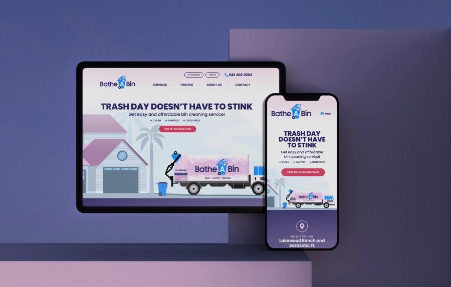
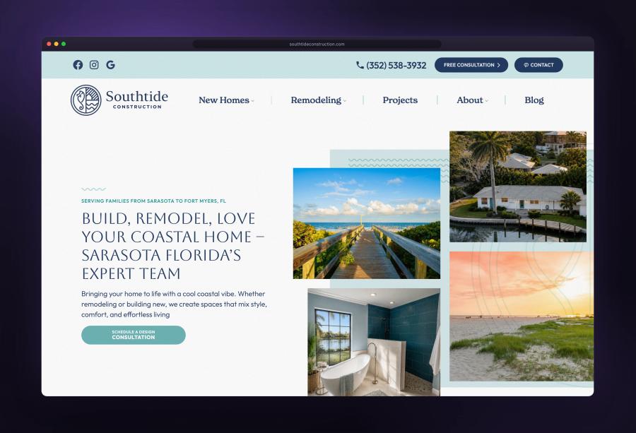
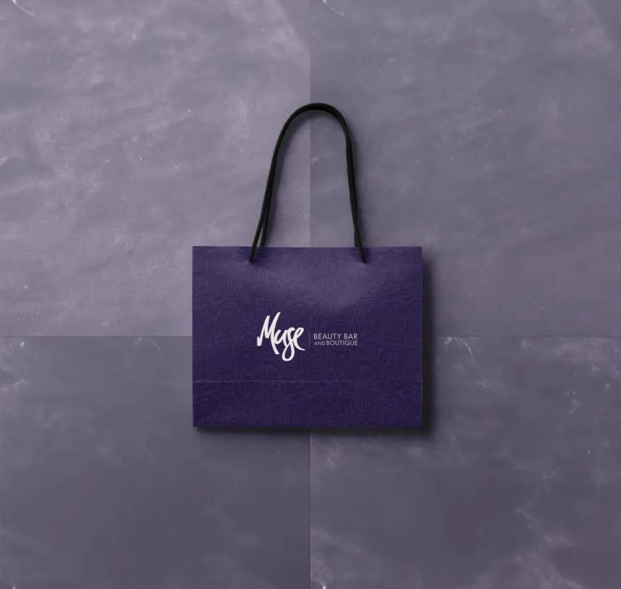
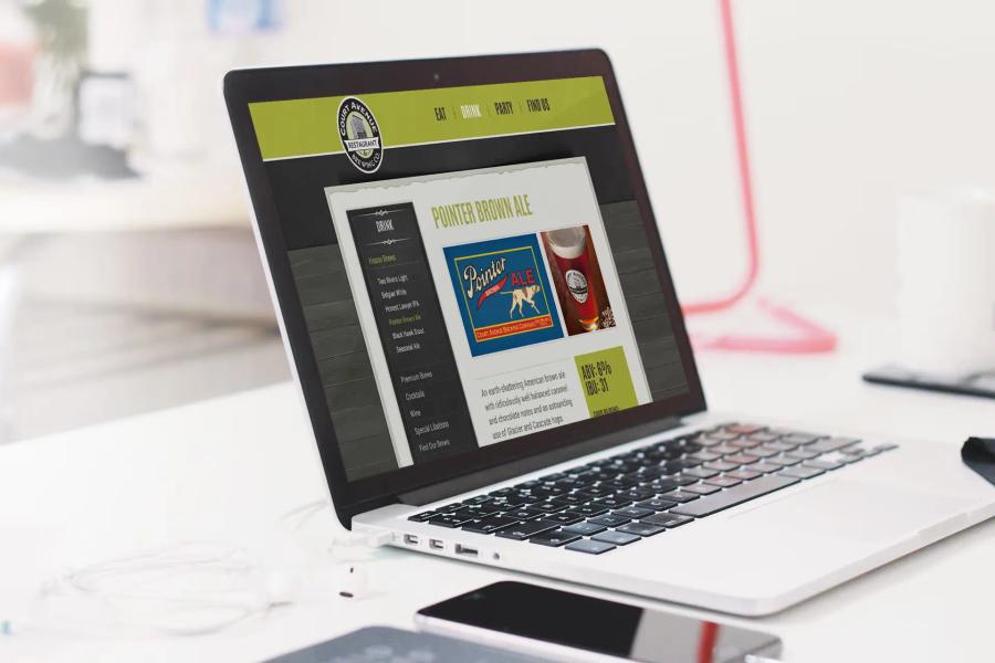
Construction, beauty, hospitality, professional services, and a manufacturer's brand guide. Click any of them for the full case study.
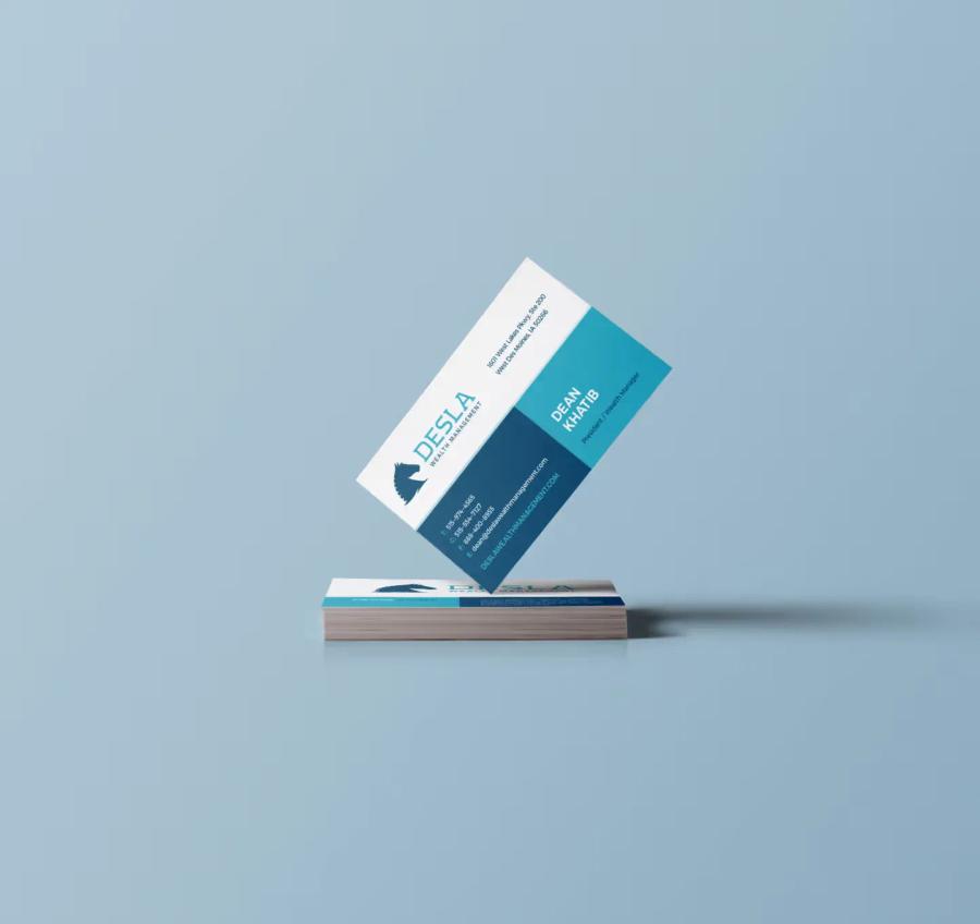
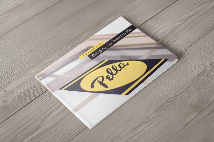
How to tell if a mark will hold up.
A logo holds up or falls apart for reasons that have almost nothing to do with taste. The mark has to survive a 16-pixel favicon, a single-color embroidery stitch on a polo, a reversed-out version on a dark vehicle wrap, and a circular crop on a Google Business Profile avatar. Most marks that break in year two failed those tests in week one — nobody ran them. We run them before you ever see a concept, so each of the three directions is drawn to hold at favicon size, in one color, and at its smallest legible stroke weight. The favicon, app icon, and full color-space files come with delivery once you've picked a direction.
Do you need a symbol, or is a wordmark enough? Most small businesses are better served by a well-drawn wordmark plus a monogram for tight spaces. A symbol only earns its keep once enough people recognize it with the name removed, and that comes from years of consistent placement, not a clever sketch. Settling that question is the first thing Discovery does. It also frames the bigger one: a mark is a component, not a system. Type scale, color tokens, photography direction, and templates are what make a business read as one brand — that is brand identity work, and logo design is included inside it.
Logos rarely die on a screen. They die in production — yard signs, truck doors, hard hats, invoice headers, and the shirt an installer wears into someone's living room. That is why delivery includes Pantone specs alongside RGB and CMYK, and why the usage guide sets clear-space and minimum-size rules instead of leaving them to whoever opens the file next. Holding that line across every printed and digital piece is graphic design systems work. For construction and home-improvement brands, the truck is the billboard, so we design for the truck first and the screen second.
If you already have a mark you like, the honest answer is often to redraw it, not replace it. Rebuilding a clean vector, fixing kerning, and locking color specs preserves recognition you already paid for. Replacement is the right call when the mark cannot hold at small sizes, when it looks like three competitors', or when it is about to anchor a new site — which is why logo work and web design are usually sequenced together. Both sit inside the Trust System: recognition first, then everything you build on top of it.
Four phases. Three to five weeks.
Fast without feeling rushed. Thorough without stretching timelines. We've done this 200+ times.
Discovery
Interview, audit, aesthetic direction. We understand the assignment before sketching.
Week 1Concepts
Three directional concepts with rationale. You pick one to refine.
Week 2Refinement
Two rounds of focused polish on your chosen mark, including all lockups.
Weeks 3–4Delivery
All formats, all color spaces, usage guide. You're ready to use it Monday.
Week 5Three tiers. No packages you'll regret.
Priced by complexity and scope. Every tier includes source files, every format, usage guide, and our 10-year longevity standard.
Single symbol or wordmark for a focused brand.
- 3 initial concepts
- 2 refinement rounds
- Symbol OR wordmark
- All file formats
- 1-page usage guide
Symbol + wordmark + full lockup system. The standard most brands need.
- 3 initial concepts
- 3 refinement rounds
- Symbol + wordmark + monogram
- Horizontal + stacked lockups
- Favicon + app icon
- Extended usage guide (8pp)
Full logo system with animation, extensive variants, and physical-environment specs.
- Everything in System
- Motion-logo (Lottie + MP4)
- Vehicle / signage specs
- Sub-brand extensions
- Dedicated designer
Marks that still run.
Logos we designed 6, 8, 11 years ago — and the businesses still using them every day.
Dinko Design helped launch our business from its infancy. They took what was just a thought in my head, to a full-blown website and branding kit. Phenomenal look and so professional in my field that people can't believe we are a small business. We hear often that we must be bigger or a franchise because every detail of our brand is spot on.
Dinko is truly a digital artist. He can create an entire brand, website, and more from scratch. He is an expert when it comes to branding and monetizing in every digital format. He built us a beautiful website that is both aesthetically pleasing and user friendly. It doesn't stop at building though. You can trust him to use all his marketing and business tools to help you succeed.
Working with Dinko Design has been an absolute pleasure. His professionalism and partnership was clear from the very first consultation. He genuinely cared about understanding my business and its goals. His branding and design work is sophisticated and cohesive. If you're looking for a partner who combines collaboration, strategy with design excellence go with Dinko Design.
The questions we actually get.
Why only 3 concepts?+
Do we own the logo completely?+
What if we want changes after the 2–3 rounds?+
Can you just redraw our existing logo?+
Do you do AI-assisted logo design?+
What's the difference between this and your Brand & Identity service?+
Industries we serve
Built for contractors & home service businesses
We specialize in web design and marketing for the trades. Every service we offer is tuned for your industry.
Ready for a mark that holds up for a decade?
Free 20-min logo consultation. We'll audit your current mark and tell you honestly what's working.